In today’s market, traders are surrounded by promises of the “next great edge.” Algorithms, artificial intelligence, custom indicators, and new trading systems are constantly being promoted as the solution for making money faster and more easily.
Some things never change.
Traders have always searched for something new that will give them certainty. But markets do not operate on certainty. They operate on probabilities, patterns, trader behavior, and risk management.
One of the most recognizable patterns — and one that traders and algorithms both continue to watch — is the retracement within an uptrend.
This pattern has been around as long as charts have existed. I’ve taught its basics since the early 1990s, and it still works today because it reflects something that hasn't changed: human behavior.
The basic attributes are simple:
A stock, ETF, or market is making higher highs and higher lows. It is in an uptrend. After an advance, it begins to pull back toward an area where buyers previously stepped in. That area becomes price support. As price declines into support, traders begin watching for signs that selling is slowing and buyers are returning.
You can use one or two simple moving averages to visually smooth the trend, but the real focus should always be on price.
At Master Trader, we teach traders to identify the trend, locate meaningful price support or resistance, and then wait for a confirming price pattern before taking action.
That confirmation can happen in several ways. It might be a bottoming tail bar, a bullish 180, a gap-down reversal, a turn above a prior bar’s high, or a combination of bars that show sellers losing control and buyers stepping in.
The exact bar pattern may vary, but Master Trader Bar-by-Bar Analysis teaches you how to read what is happening as it unfolds, rather than guessing ahead of time.
Once the turn is in place, the trade can be managed according to a written plan.
That brings us to this week’s chart: Casey’s General Stores — CASY.

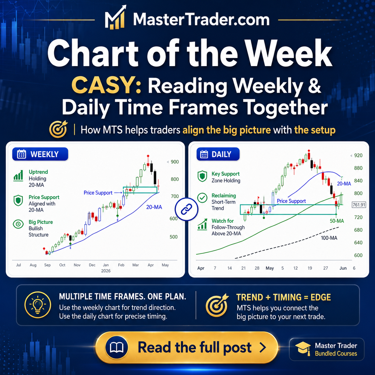
CASY Weekly Chart: The Dominant Time Frame
The weekly chart of Casey’s General Stores shows a stock in a strong uptrend.
CASY made a significant advance, created higher highs and higher lows, and has now pulled back over the last several weeks into an area of prior price support. That same area also aligns with the rising 20-period moving average on the weekly chart.
From a Master Trader perspective, this is a classic retracement pattern within a dominant uptrend.
The stock has not made “the turn” yet, but it is in an area where traders should be alert for one to develop. That does not mean we predict it must happen. It means the pattern has reached the area where, historically, this type of setup often begins to stabilize and attempt a reversal.
That distinction is important.
We are not fortune-tellers. We are reading the pattern, the location, and the timeframe. The weekly chart gives us the broader bias: CASY is pulling back into an area where buyers may begin to defend the trend.
Master Trader Tip: The essence of technical analysis is recognizing patterns that many market participants can see. When enough traders see the same area and act on it, the pattern can become a self-fulfilling prophecy.
Another important point on the chart: CASY is scheduled to report earnings.
Always know when a stock is reporting earnings. Earnings can confirm the pattern and become the catalyst for the next move, or they can completely disrupt the setup. A good pattern does not remove event risk.
That is why we do not blindly buy support. We wait for confirmation.
Now let’s look at the daily chart to see how the perspective changes and consider any questions you may have.
CASY Daily Chart: The Lower Time Frame Raises Questions
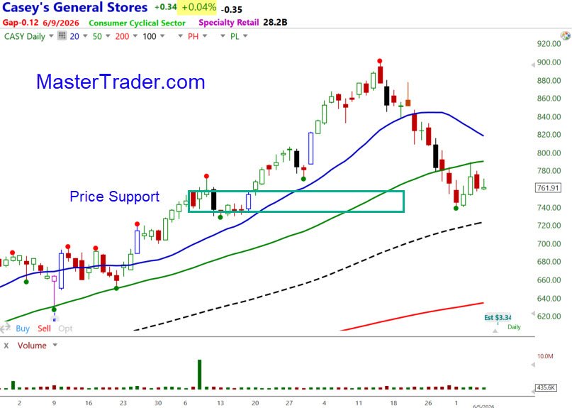
The daily chart shows the same stock and the same support area, but it gives us a different view.
On the daily timeframe, CASY has been declining into price support. However, unlike the weekly chart, the daily chart does not look as cleanly bullish. Price has dropped below the 20-MA and 50-MA, and those moving averages have turned lower.
That naturally raises a question:
How does a trader operate when the higher timeframe looks constructive, but the lower timeframe still looks weak?
This happens often. It is one of the reasons many traders become confused when using multiple time frames. One chart looks bullish, another looks bearish, and the trader does not know which one to trust.
The answer begins with a simple assumption:
The higher timeframe is dominant until the evidence says otherwise.
In this case, the weekly chart provides the larger bullish bias. The daily chart tells us that CASY has not yet confirmed that bias. In other words, the weekly chart says, “Be interested,” but the daily chart says, “Wait.”
That is a big difference.
A lower-timeframe pullback can eventually align with the higher-timeframe trend, but that alignment must be confirmed by price. We want to see the daily chart begin to turn in a way that supports the weekly setup.
That could happen through a bullish reversal bar, a bottoming pattern, a gap reversal after earnings, or a move back above a prior bar’s high. The exact form does not need to be predicted in advance.
This is where bar-by-bar analysis removes much of the uncertainty. Instead of trying to guess the exact pattern, we watch how price behaves at the support area.
Are sellers still in control?
Is the stock accelerating lower?
Is it stabilizing?
Are buyers beginning to step in?
Is price rejecting the support area?
Is there a bullish bar that creates a tradable entry above a prior high?
Those are the questions that matter.
What About the Moving Averages Overhead?
Some traders may look at the daily chart and ask, “What about the declining moving averages above price? Won’t they stop the stock from moving higher?”
They might. They might not.
Moving averages are useful visual aids, but they are still subjective reference points. Different traders use different periods. Some use the 20-MA, 50-MA, 100-MA, 200-MA, exponential averages, simple averages, or none at all.
Price support and the dominant trend carry more weight than a moving average alone.
That does not mean moving averages should be ignored. They can create reactions, pauses, or temporary resistance. But they should not override a higher-quality price pattern that is aligned with the dominant timeframe.
At Master Trader, price comes first.
The larger pattern, the support area, the trend, the quality of the pullback, and the confirmation bar are more important than any single moving average.
How the Two Time Frames Work Together
The weekly chart gives us the big picture.
CASY is in an uptrend and has pulled back to a logical area of support.
The daily chart gives us the tactical view.
CASY has not yet confirmed a reversal and still shows short-term weakness.
Together, the message is clear:
CASY is a stock to watch, not a stock to anticipate blindly.
If earnings disrupt the pattern and price breaks support with authority, the setup is no longer valid. There is no argument with price.
But if CASY stabilizes in this area and begins to form a bullish daily reversal pattern, that would bring the lower timeframe into alignment with the higher timeframe.
That is when the setup becomes more actionable.
Master Trader Tip: Multiple timeframe analysis is not about finding charts that all look perfect at the same moment. It is about knowing which timeframe controls the bias, which timeframe provides the entry, and what price must do to confirm the trade idea.

Building a Trading Belief System
What I’ve explained here is the beginning of a trading plan.
It is also the beginning of a trading belief system.
A trader needs more than opinions, indicators, and predictions. A trader needs objective criteria that guide decisions before, during, and after the trade.
That belief system should answer questions like:
What is the dominant trend?
Where is meaningful support or resistance?
Is the stock extended or correcting?
Is the lower timeframe aligned with the higher timeframe?
What pattern confirms the setup?
Where is the entry?
Where is the stop?
What invalidates the trade?
How will the trade be managed?
Without that structure, traders often fall back on random combinations of indicators, trendlines, Fibonacci levels, oscillators, clouds, or whatever tool they saw promoted most recently.
The result is usually confusion, not confidence.
The Master Trader approach is different. We teach traders how to read price, understand multiple time frames, identify high-quality patterns, and build a structured decision-making process.
That is exactly what the Master Trader Bundled Courses are designed to do.
Instead of learning disconnected pieces of technical analysis, the bundled courses bring the process together: trend analysis, support and resistance, bar-by-bar price reading, gap strategies, trade management, options strategies, and the broader market tools needed to make better trading and investing decisions.
If you want to become more self-reliant and learn how to read the market with a complete process, take a look at the Master Trader Bundled Courses.
Recognizable patterns are still there.
The key is learning how to read them correctly, across the right time frames, with a plan that tells you when to act — and when to wait.
If you have found this post helpful, Share it Forward with other Traders
All the best
Greg Capra